 EN


A gift bag is judged in about the time it takes to hand it over. The customer sees the colour, feels the handle and notices whether the bag holds its shape — and only then reads the logo. That order explains why gift paper bags that look expensive in a catalogue photograph often feel cheap in the hand, and why a plain kraft bag with the right board and handle can feel like more.
This guide covers the decisions that actually change how a bag is perceived: contrast, substrate, finish, handle and proportion — plus the personalisation that turns a bag into a marketing asset.
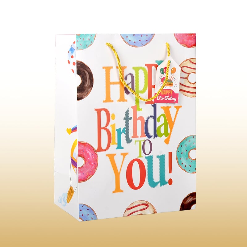
Design That Works at Arm's Length
Colour and Contrast
Colour does most of the work before any text is read. Two saturated colours with strong separation stay legible across a shop floor; four pastel tones dissolve into grey at ten metres. That is the practical rule for gift paper bags: limit the palette, then use contrast to build hierarchy rather than adding more colours.
The substrate sets the limit. On kraft, every ink shifts warm, so a brand blue printed on white board will look greener here unless it is proofed on the actual stock. Seasonal colour is worth planning around, but the base palette should stay fixed so the bag remains recognisable in a holiday edition.
Type and Hierarchy
One word at the right scale beats a paragraph at the wrong one. A bag is read at a glance and at an angle, so the brand name should be the largest element, with everything else — a tagline, a handle, a URL — clearly subordinate.
Script fonts suit gifting and look wrong on a grocery bag; clean sans-serifs read as modern and premium. Whichever you choose, check the smallest text at actual size on a curved surface, because thin strokes break up in print and become illegible exactly where a customer would look.
Substrate and Finish
Kraft, Coated or Textured
Kraft gift paper bags read natural and honest, take a single-colour print beautifully, and hide scuffs better than white board. Coated stock gives sharper detail and more accurate colour, which matters for photographic artwork or a precise brand palette. Textured and uncoated papers sit between: quieter than gloss, warmer than white, and pleasant to hold.
Weight is the other half of perceived quality in gift paper bags. A heavier sheet holds a crisp crease, keeps the gusset square and resists the crumpling that makes a bag look used before it reaches the customer. Lighter stock saves money per bag and costs it back in damage and in how cheap the handover feels.
Finishing That Reads as Value
On gift paper bags, matte lamination gives a low-glare surface that photographs well and resists scuffing in a shopping bag; gloss maximises colour but shows fingerprints. Spot UV adds shine to a single element, usually the logo, and creates contrast without a second colour. Hot stamping and embossing add depth you can feel with a thumb, which is the sense gift paper bags are actually judged by.
One caution for gift paper bags: a plastic laminate can take the bag out of the paper recycling stream. If a sustainability claim is part of the brand, a water-based coating or an uncoated stock is the better pairing.
Structure and Handle
Handle Types and Load
The handle is where most gift paper bags fail. Twisted paper handles are economical and suit mid-weight retail; flat ribbon and cotton cord read as premium and suit gifting; die-cut handles are the cheapest and the most limited, because the load hangs on a cut edge of the bag body. A reinforced patch at the junction costs little and changes the load rating more than any other upgrade.
Placement matters as much as material. Handles set too close to the edges tear the top edge under load; handles set too wide make the bag awkward to carry. Test with the heaviest item the bag is likely to hold, not the average one.
Proportion, Gusset and Base
Proportion decides whether a bag looks confident. A bag that is tall and narrow with a shallow gusset will lean when filled; a square base with a proper gusset stands on a counter and photographs better. Extreme aspect ratios also stress the folds, which is where creasing and eventual tearing begin.
For gift paper bags, a small family of sizes usually serves better than a long list: one for cosmetics or jewellery, one for clothing, one for multiple items. Standardising keeps tooling and storage manageable while still letting each bag look purpose-built.
| Decision | Who it appeals to | Watch out for |
|---|---|---|
| Uncoated kraft | Sustainable, craft-led brands | Colour shifts warm; fine detail softens |
| Matte lamination | Premium retail and gifting | Plastic film can block recycling |
| Ribbon handle | Luxury and occasion purchases | Higher unit cost, slower assembly |
| Die-cut handle | Light, low-cost retail | Low load rating at the cut edge |
Personalisation
Logo Placement on a Bag
The front panel of gift paper bags is the billboard, but the bag is seen from the side and from above while carried. Repeating a small mark on the gusset or the base costs almost nothing and doubles the angles that carry the brand. Scale should stay below the point where the mark looks like a warning label.
Print cost is charged per run rather than per bag, so gift paper bags reward planning: one larger order with two designs is usually cheaper per unit than two small orders of the same total quantity.
Seasonal and Event Editions
Because the structure stays the same and only the print changes, a seasonal edition is a design decision rather than a tooling investment. A holiday version, a collaboration with a local illustrator or an event lock-up can all run on the same bag, giving regular customers a reason to return and social media something new to show.
The constraint is scheduling: print runs are planned weeks ahead, so a seasonal bag ordered in advance is routine and one ordered late is a rush job at a rush price.
FAQ
What paper weight is right for a durable gift bag?
It depends on the load and the handle. A heavier sheet creases better and resists crushing, but the handle junction fails first regardless of board weight. Ask for the finished bag weight and a tested load rather than a single number for the paper.
How can gift paper bags stay attractive and be more eco-friendly?
Use certified or recycled fibre, water-based inks and a paper handle, and skip plastic lamination if a recycling message matters. Uncoated kraft with one strong colour often looks better than a laminated bag with four.
What design mistakes should be avoided?
Too many colours, text below legible size on a curved panel, and artwork approved on a flat proof rather than on the actual board. Structural shortcuts — light stock, weak handle, extreme proportions — undo good design quickly.
How often should the design change?
Keep the mark, palette and layout stable; change the campaign layer — a seasonal pattern, a collaboration, an event lock-up. Recognition only compounds if the core identity stops moving.
Attractive gift paper bags are not the ones with the most decoration. They are the ones where colour, board, finish and handle agree with each other, so the bag feels considered in the hand — which is the only test a customer actually applies.